What’s all the buzz about? Crib Sheet 2.0

Over the past few months, we’ve been busy bees building a great new update to our app, Crib Sheet. Now we’re really excited for you to see what all the buzz is about.

More Beauty

The most obvious improvement can be seen in the news feed. We’ve added an image to every story to add more beauty and “pop” to the app.


The banner at the top of the news tab also rotates to make the app feel more “alive”, and to remind users about all of the great content the app has to offer.

Easier Sharing

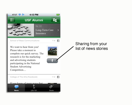
You’ll find one-tap sharing on almost every screen of the app. We think that easier sharing on Facebook, Twitter, email, and SMS will result in many more downloads and visits of your app.


Since Crib Sheet is customized for a school or organization, we think sharing the app with a smaller group of friends (e.g. fellow alumni) is more powerful than sharing with ALL friends.

So, we’ve added a special Facebook sharing function which allows users to share with friends from ONLY your organization.


Faster

Speed in an app is crucial, so we found ways to increase speed and reduce taps everywhere. For example, you’ll find a faster news feed and one-tap sharing right from your news feed.


In addition, tapping on a news story now takes you directly to the full article, which is particularly powerful on the iPad:

More Guidance

We provide more instructions for the best way to enjoy the app.

Our rotating banner provides more helpful tips.
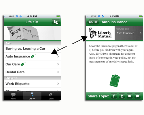

Relevant Ads

We view advertisers as important partners to the app.

Our advertisers give schools the chance to subscribe at discounted rates and they give users the chance to take the “next step” when learning about auto insurance, investing, etc.

So we’ve made ads more visible (when in context) within our life 101 content.


It’s with great excitement that we debut these updates. Search almost any app store for “Crib Sheet” to see many customer examples.

We welcome feedback or suggestions – e-mail me. We are already back in the hive, working to make your app experience even sweeter.

Enjoy!

Subscribe to the Cap & Compass Blog by Email

A Happy Update To Our Crib Sheet App


One of our newest topic photos

The happiness of our customers is what drives our happiness, which makes us very pleased to announce a great new update to our Crib Sheet app.

Thanks to the great feedback from our buyers and users, we’ve made a bunch of improvements which make the app easier to use and understand.

What’s the most important highlight of this update? Five new smart and helpful topics that range from the keys to happiness to the keys of a rental car.

(1) Happiness: Yep, read this topic and you’ll be happy forever.

(2) Disability Insurance: Prepare yourself for that “staple injury” that prevents you from earning a paycheck.

(3) Wills & Trusts: We know you’ll never die, but just in case… we’ve got your crib sheet for planning for the stuff and people you’ll leave behind.

(4) Long-term Care Insurance: Until the Fountain of Youth is sold in aisle 6, this topic is a must read.

(5) Rental Cars: We help you navigate all those extra fees, insurance choices and more.

We hope you love the new content. And stay tuned, because we have more exciting updates to come soon.

Subscribe to the Cap & Compass Blog by Email

Creative Features: Spice Up Your News Feed

In our recent post, we highlighted our “secret sauce” of the features and feeds in the News tab of our mobile app.

Maybe we’re hungry around here, but this post is focused on ideas to add in some extra flavor to your News tab through the creative use of features.

For starters, we offer five types of features. How you use them is only limited to your imagination:

(1) Links: Direct users to any external website such as benefits or giving pages, class notes, spirit store, event calendar, directory or an important YouTube video.

(2) Feedback forms: Request user-specific feedback such as address updates, RSVPs, or pledges.

(3) Polls: Request and share anonymous feedback such as demographic information, alumni event planning, or app feedback.

(4) Photos: Post a series of photos to promote an event, highlight an achievement, or show campus happenings.

(5) Emails: Give users a simple way to e-mail someone other than the administrator of the app, for services such as resume review, transcript request, or class notes submission.

Be creative! Below are some examples from our wonderful customers:

Poll Feature: Saint Joseph's Demographic Poll

Link Feature: NC State's link to a Students Today Alumni Tomorrow video.

For a creative example of a feedback form, read our post on LaSalle University’s Scavenger Hunt.

Think of features as spices. Sprinkle them into your News feed to keep app users abreast of alumni events and resources, and garner their feedback in return.

Subscribe to the Cap & Compass Blog by Email

Feeds & Features: Our Secret Sauce

The Colonel has a secret recipe. Coca-Cola locks up their secret formula in a vault. Our app has its own secret sauce: our feeds and features.

Feeds

Feeds contain the stories told via your social media (Facebook, Flicker, YouTube, RSS, etc). The posts appear chronologically (most recent at the top), so if you include a lot of feeds, your app always has something fresh.

Since users want news that is both fresh and relevant to them, they select feeds important to them (e.g. engineering and football). Your alumni return for news they want to read.

Add as many feeds as possible (newspapers, clubs, blogs, and so on). With lots of feeds, you let users select niche interests from an institution they love.

Features

Think of features as “special messages” from your office which you want to get read or responded to.

Features can include address update forms, event RSVPS, links to your website, and videos promoting your next event.

Features appear every third item in your news feed and never disappear (users can’t turn them off and they never “roll down” your feed). When Bobby checks his news, he’ll see your features.

Our buyers add and delete as many features as they’d like, and prioritize them in any order. Update a feature and your app updates immediately.

We think the reason our secret sauce works is its simplicity. Users read news they love in one simple place. Schools get their messages (features) read.

So that’s our secret sauce. We think it’s better than a bucket of chicken and a medium-sized drink.

Subscribe to the Cap & Compass Blog by Email

Our App + Your Mobile Website

Mobile 101: This post is part of our educational series on mobile technology. If you are new to the smart phone/app arena, this series is a good place to start.

An apple pie without the cheese
is like a hug without a squeeze.

So, a mobile website without an app
is like a road not on the map.

In other words, your mobile website will get more use when combined with our native app, Crib Sheet.

Schools with great mobile websites often contact us because their sites are not getting enough traffic. Some problems:

Discovery of mobile websites is difficult. Mobile websites are not listed in app stores. Native apps are.

– Return visits are clunky. To return to a mobile website, users have to remember and type in a URL address, or go through a messy process to bookmark it on their mobile browser. Native apps, on the other hand, are easily accessed via app icons that live on your phone.

Crib Sheet can serve as the missing link between your alumni and your mobile website with something we call “features.”

Features appear every third item in our news feed and can direct users back to any mobile website (or any website).

Link to a mobile website for online giving, class notes, alumni benefits, or your directory:

Since users enjoy returning to Crib Sheet to get updates on their alma mater’s football team, alumni events, or whatever, they’ll always see your features interspersed in their feed.

If your alumni are visiting your website from a mobile device, you need a mobile website. If you want more traffic, consider our app as a useful and complimentary “portal” to keep them coming back time and time again.

Subscribe to the Cap & Compass Blog by Email

Quiet The Noise: Our Dedicated Newsfeed

Using social media posts to reach your alumni is a bit like shouting from a crowd in a moving train – your post is one among many and disappears quickly.

Take Facebook as an example: When viewed on an iPhone, an average user gets an initial view of 20 posts from their 130 friends. If your alumnus checks Facebook a few hours after your post, your train may already be in Topeka (or something).

To complicate matters, Facebook (by default) only shows posts from those friends or pages which it feels are most important to a user (“Top News”). To see ALL posts, a user has to change to the “Most Recent” feed.

So, how do you make yourself heard amid all the noise? Give your alumni our app, which provides a DEDICATED news feed for your institution. After you select which feeds to broadcast, your alumni and members read only YOUR news.

And users like the simplicity. Your app is an uncluttered place with fresh content from across your institution.

MSU's News Tab: Alumni News, Sports and More

Don’t get lost in the crowd – make the most of your social media with our app.

Subscribe to the Cap & Compass Blog by Email

Update to iPhone/iPad App

In a previous post, I wrote about the benefits to removing “speedbumps” to increase usability.

We obsessively look at our app, crib sheet, for “speedbumps”.  When we find them, we go at ‘em with jackhammers.

To that end, we’re excited to announce a big update for the iPhone and iPad.

Much Faster

Behind the scenes, we’re processing thousands of social media feeds from our customers’ apps. We’re kind of like Grand Central Station.

When you open the app to get updated news, you want it now. So we redesigned the “plumbing” for downloading these new feeds. The difference, depending on a variety of factors, can be significant: 3 seconds vs. 20 seconds.

Visual Tricks

When the news feed is updating, we now hide the “Updating News…” tray and give users the ability to read old feeds while their new feeds are added.

By making this change, the app “feels” faster.

Improved Sharing

Users can now share the app and specific pages with their friends via Facebook, Twitter, SMS, and email.

iPad Redesign

We’ve made subtle changes to the iPad design to improve navigation. In short, now you always know where you are within in the app.

In college, I took a class about music in film. My professor talked about how the best music was never heard or remembered. It just made the film better.

For new users, the updates to our iPad design won’t be noticed. Instead, they just make the experience better.

Timing

Expect this update to be live by the week of February 21st. Our current customers won’t have to do anything.

In short, this update removes speedbumps. We think your users will love it.

Subscribe to the Cap & Compass Blog by Email

BlackBerry App is Launched

For all you CrackBerry users, we’ve finally got your fix. We’re very excited to announce that “crib sheet,” our mobile app, is now available on BlackBerry.

The Case for BlackBerry

In recent stats (below), BlackBerry (RIM) is still the number one smartphone in the US.

While BlackBerry phones aren’t used for apps as much as the iPhone or Android devices, you can’t ignore the platform simply due to its sheer number of users.

By being on BlackBerry, our “crib sheet” app has the potential to reach a much larger audience.

Our BlackBerry App Journey

We started our BlackBerry development process at the same time as our Android development. We had just rolled out our app on the iPhone and it was time to expand to other platforms.

BlackBerry set itself apart in the development process because, frankly, their phones aren’t built to run apps. They were built to provide mobile email to the corporate masses.

The most obvious limitation is the screens – they’re often small and low resolution. The stuff “behind the screen” is limited too: tools for BlackBerry developers are sparse.

If coding an app is like building a house, Apple gives you a frame while BlackBerry makes you saw boards from trees. Consequently, the look and feel for many BlackBerry apps is often pretty basic.

There’s a joke circulating on the internet for how the popular Angry Birds app would look on BlackBerry.

Angry Birds App on the iPhone

Angry Birds App as imagined on BlackBerry

Other complexities in our BlackBerry process:

– a bazillion screen sizes,
– close to a bazillion versions of the operating system on old devices
– quite a few user input methods (touchscreen, keyboard, and hybrids)

Despite these limitations, I was determined to build an app that was sweet to the eye and fun in your hand. I started by contracting with one of the best BlackBerry design firms (there aren’t many) in the industry.

Much the same as Android, we started with high-level wireframes (blueprints):

Then began to get more specific:

And finally they created some pixel-specific drawings:

With final plans in hand, we forged on with a talented team of BlackBerry coders. We’re super proud of the result.

View the BlackBerry App

To see our BlackBerry app for yourself, visit one of our customers’ desktop app sites. Then click on “BlackBerry” on the top right of their page.

Our “crib sheet” app runs on BlackBerry devices with an OS of 4.6 and higher, making it available on all but the very oldest BlackBerry models.

We think your users will love it.

(Note: For those few of you with a “touchscreen” Blackberry, our app will be ready for you in another week.)

Subscribe to the Cap & Compass Blog by Email

Android App is Launched

It’s official – our mobile app, crib sheet, has joined the Android party.

What’s Android?

Google is the maker of Android software, which they give away to carriers (like Verizon) so that phone users like us search more on Google. Consequently, you’ll find Android software just about everywhere (e.g. Droid, Evo, Galaxy, HTC Hero, Captivate, and many more).

Why Android Matters

There are as many (if not more) Android phone users as there are iPhone users. This means our “crib sheet” app can now reach double the number of potential users.

In the coming year, we expect it will mean even more – Android is big and about to explode.

The Birth of our Android App

Our Android development process began in January 2010, soon after we rolled out our app on the iPhone, with the search for a new design and coding team.

Android phones are completely different animals relative to the iPhone:

– different navigation (Android devices have built-in “back” and “menu” buttons)
– wider universe of phones and operating systems
– multiple screen sizes
– various input methods (keyboard and/or touchscreen)
– completely different coding language.

You’d be surprised at how seemingly trivial changes, like a keyboard or a “back” navigation button, can fundamentally change how you design an app relative to the iPhone.

I started by contracting with one of the best designers in the industry. He helped me see our app in new ways, and suggested valuable improvements to functionality and flow.

We began with some big picture “wireframes” (like blueprints for a house):

Then got more specific:

After weeks of revisions, my designers created multiple pixel-by-pixel specific screens:

These plans were finally delivered to my talented team of coders. Months of back and forths, testing, fixes, and now we’re live.

And the app is beautiful.

See Our Android App

If you have an Android device, search the Android Market for “crib sheet” to see all of our customers’ apps. It’s free.

If you don’t have an Android device, there are over 300,000 activations per DAY. So you probably know someone that DOES.

Our app works on over 95% of all Android phones (all but the oldest models – OS 1.6 and above). We think users will love it.

Subscribe to the Cap & Compass Blog by Email

The Birth of our Mobile App

All through 2008, I kept hearing “How about the book in an electronic format?” from customers. I looked into creating an “e-version” of our book, but I didn’t think (and still don’t think) anyone wants to read a book on their computer.

In January 2009, I got my first iPhone. I kept looking for new ways to use it in my daily life. Once you start using an iPhone, you get religion. You also get apps.

I started to think about how our content might work in an app. This post is a “behind the scenes” of how our app was born.

One of the early questions you have to answer when building an app is…

Who Should Build My App?

When we started building our iPhone app in March 2009, the app development world was like the wild west – a brand new field full of pioneers and pirates. It still is.

Today's industry of mobile app developers

I quickly learned that if you outsource your work overseas, you can save a lot of money.

First Contract

I awarded my first contract to India and fired the providers after about a month because they were incompetent. 

My lesson: Too many developers talk the talk, but few can actually walk the walk.

Second Contract

I awarded my second contract to a higher-priced provider in Vietnam. Here’s one of my favorite email responses from my developer:

You know the old expression, “When your iPhone developer accidentally responds to your question in Vietnamese, Google Translate is your friend.”? Well, just for kicks, I used it:

After over four months, we finally parted ways over communication breakdowns.  

My lesson: When your developers speak Vietnamese and “Objective C” (the programming language for the iPhone) but you speak English and “non-programmer”, the result is a crappy app.

Third Contract

I bit the bullet and paid up for developers in the States, though I did a lot of digging to find a firm that was good at both design and coding (a rarity in the industry).

Although I paid many, many, many multiples more in costs, I picked a fantastic provider and I’m still working with them today (Michael: I hope your little one enjoys her horseback riding lessons and private school tuition). I’m often on the phone with them daily, and they have grown into the role of maintaining the app.  

My lesson: Communication, design and competent coding are all integral to building a good app.  Don’t look at your developer relationship as a six month project, as you’ll likely be working with them for years.

The resulting crib sheet app is our new baby:

It packages our popular real world content with our customers’ brand and news.  It allows users to send address updates, answer polls, RSVP for events.

And it can leap over tall burning buildings to rescue babies stuck in trees.

Subscribe to the Cap & Compass Blog by Email